 The main colours featured in this poster are orange and brown. Orange is a colour derived from red and yellow. It reflects anger however because of the blend of yellow, the colour orange does not reflect anger as strongly as red. Orange is also a very energetic colour, and reflects warmth as it has connotations of the sun. Orange is a colour that demands attention, it is mentally stimulating and considered a sociable colour. Brown is a good background colour and it reflects wholesomeness and honesty as it is a natural earthy colour.
- The Typography is mainly white, which is a neutral colour therefore making the main attention on the images in the poster rather than the font.
- The 'M' in murder is red, reflecting danger, which would relate to the word it is part of, as murder is a dangerous act. Red could also reflect passion in this instance as there is a couple in the background of this poster that could reflect the theme of passion.
- There is some small typography in the top right hand corner of the poster, it may possible be small so the audience has to look closer to read what it says. It is written in a different font to the other fonts on the page, this makes it stand out slightly more but not enough to take the attention away from the main, larger typography in the poster.
- The male is only just slightly more in the foreground so the audience know he is the main character.
- The messages in the poster are mainly verbal as the images do not reveal a lot of what the film may be about. It is the small typography that gives a clue to the narrative.
Saturday, 18 September 2010
A Perfect Murder

Friday, 17 September 2010
Running Scared
 The main colours in this poster are blue, white and black, the poster also has a hint of red within the title of the film. The blue red and black mean the same as in the Taxi Driver poster deconstruction link - Taxi Driver. The colour red means power and can reflect passionate love, or anger and violence.
 - One of the main symbols used in this poster is a gun. The gun is used to represent violence as it is a type of weaponry. The audience therefore expect this film to contain some level of violence.
- The messages in the poster are mainly visual. The characters in the poster all show some sort of facial expression that demonstrates aspects of their character.
- The intended audience for the poster would be young adults upwards, especially anyone who has an interest in watching films that feature crime and violence.
- The genre referred to in this poster is crime/thriller because of the colours and the intense look on the main characters face, the audience expect this to be a tense film.

No Country For Old Men
- Black, orange and grey are the most prominent colours in this poster.
- Orange is a colour that signifies wealth, desire, pleasure, thirst for action and aggression. These all feature in the film
- Black is associated with power, elegance, formality, death, evil, and mystery. Black is a mysterious color associated with fear and the unknown (black holes). It usually has a negative connotation (blacklist, black humor, 'black death').
- Who is the intended audience for this poster?
- The target audience for this poster would be anyone who has an interest in geography as this film features a man travelling around different place in the world to 'getaway'. This poster also features a man carrying a gun so anyone who like to watch film containing violence.

- What persuasive techniques are used in this poster?
- The directors and actors names.
- What genres are referred to in this poster?
- Thriller as the is a man running with a gun in his hand suggesting he is being chased/on the run.
- Is a star used as a USP?
- No
- How is attention gained?
- Attention is gained by the use of the golden sector and the use of the rule of thirds.
- There are three main parts that the audience focus their attention on, the characters eyes in the top third, the title of the film in the bottom third and the character just about the title. These areas are where the audiences eyes are drawn an this is know as the golden sector.
- Are the messages in the poster primarily visual, verbal or both?
- The messages in the poster are visual and verbal. There is not a clear visual message but there is when it is supported by the verbal message at the top of the poster.
- Are "expert witnesses" (critics) quoted?
- No
Fatal Attraction and Sleeping with the enemy
The typography of "Fatal" looks like neon light signs which creates the impression of sleaze and loose morals. An idea of the setting is created.
The placement of the two figures means your eye and attention is brought across everything in the poster.

The red is made more prominent by the fact that it is the only colour in the poster. It's placement and the fact that it literally tears through the central line of the poster. The narrative follows the conflict between Michael Douglas and Glenn Close. the red acts as a symbol for this conflict and tearing the couple apart; literally.
The colours of the characters reflect their personalities. the contrast between the male's white shirt and the woman's black outfit instantly show them to be "good" and "bad".
The long length of the tag line suggests more depth to the narrative than if it were much shorter (commonly used in slasher films where more emphasis is placed on the visuals).
As the actors were already well known at the tome of it's release there was no need to show their faces in the poster and the names alone create interest for the audience as a unique selling point.
By positioning the characters looking at each other we see the passion between them and instantly gain an idea of the story between them.

Julia Roberts is used as a large selling point with her face being the main focal point. The fact that she is naked and in a bath tub implies her vulnerability as a character in the film.
Thursday, 16 September 2010
Mullholland Drive

The colours yellow(gold) and black are often used together to issue a warning
The colour gold also symbolises wealth & prestige which are two things associated with the locations in this film
There is also a slight red tone which signifies death, passion, warning, blood and love
What symbols are used in this poster?
The title of the film is in the same font as the "Hollywood" sign featured in the poster. The poster also features palm trees. Both of these are associated with the West Coast of USA and wealth.
Are the messages in the poster primarily visual, verbal or both?
Mostly visual - through the use of colour, composition and semiotics. The winding road and the negative space between the girls' faces draws the eye to the Hollywood sign (Golden Sector)
Who is the intended audience for this poster?
It is likely that this is targeted at an audience of young adults as they would understand the connotations of Hollywood. As well as this, the poster features two young females. Casting these characters will allow an audience of a similar age group to really empathise with the characters.
What persuasive techniques are used in this poster?
Reference to Cannes Film Festival (a world famous & prestigious event). This will appeal to more people as it has more promise of being a decent film.
What genres are referred to in this poster?
The dark colours (black, brown, maroon & gold) and facial expressions of the characters suggest that there is a mysterious tone to the film. So it suggests the film is perhaps of a psychological/ horror/ thriller genre.
Is a star used a star used as a USP?
The actors names are used on the poster to promote the film and the actors themselves however their names are not used as a unique selling point (USP).
Are "expert witnesses" (critics) quoted?
Expert opinion is not featured on this poster, however there is reference to Cannes Film Festival.
How is attention gained?
Through the use of colours and a bold title. The darker colours (black &brown) emphasise the characters faces and the brighter title.
Taxi Driver

- The main colours used in this film poster are blue white and black. These are colours that people may find in a newspaper, this can give the impression that the film may be factual. The colour blue is a calming colour and is often used to make time pass more slowly, this is also reflected by the image of the man in the poster as he is walking, and although it is a still image the audience can imagine that this specific part in the film could be in slow motion. It also looks like the man is walking quite slow as his hands are in his pockets, this makes him look more relaxed.
White is often used as a neutral background colour, and reflects innocence and cleanliness, perhaps reflecting the man's character.
- The main figure in the poster is a man so the audience know he is the main character. He is represented in the form of a photograph suggesting the image could be a till from the film. The background is of a city, believed to be in America, so the audience know the setting of the film.
- The messages in the poster are visual, the audience can guess from the poster through the use of colour and costuming of the main character (his leather jacket and jeans) that this film has features of crime in it.
- The intended audience for this poster are adults and young people, the poster tells you about the actors in the film (Jodie Foster, Robert De Niro) therefore there are going to be characters men and women can enjoy watching. The target audience can also be anyone who is a fan of the director Martin Scorsese, as in a small typeface at the bottom of the poster the audience can see this film was directed by him.
- One of the persuasive techniques used in this poster is the typeface that tells you some of the famous actors in the film and the director. The fact that the directors name is at the bottom means that if the audience have seen one of Scorsese's films before such as The Departed or Goodfellas, they will have expectations of what the film is going to be like so they will want to know if the film meets or subverts their expectations.
- Genre codes and conventions are referred to in this poster by the use of a photograph used as the poster and the fact that the photograph is in black and white. This is a code and convention of the thriller genre.
Wednesday, 15 September 2010
The Golden Sector


The golden sector applies to both magazine covers and film posters.
It is the area where the audiences eye naturally look at. This golden sector is indicated in the pictures about by the black like with a circle along it. The Golden sector can appear and the bottom, top, left or right of the page but it is usually along the about a third of a page.
Monday, 13 September 2010
Police style photographs
 |
| Add caption |


Images we are contemplating whether to feature in our trailer. They are showing a piece of clothing as if someone has had their clothing ripped.
Time For Some Art :)


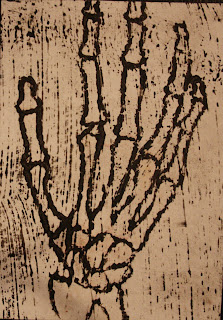


Inspired by the drawings in the book at the beginning of Se7en
These were some images we drew to feature in our trailer, some of them are studies of Leonardo Da Vinci's work but all reflect the anatomy of the body.
Body parts


These are images we are going to re-create to put in our film trailer, to show that the kidnapper has an interest in the anatomy of the body.
Leonardo Da Vinci's artwork
Subscribe to:
Posts (Atom)