We are now beginning to think about what institution would be most likely to promote our film. One of the most influential films for research for us is Silence of the Lambs. The institution they have used is Orion Pictures. However, our group has never heard of this and we are unfamiliar with that company. Because of this we have decided to not use this company.
Following more research we found that Se7en was promoted by New Line Cinema; which is a company that we are much more familiar with. Because of this we have decided to use this company's logo because we already know much more about it.
Monday, 18 October 2010
Sunday, 10 October 2010
Typography


A brief look into different types of typography mainly to make images rather than a title.
The Departed Website
The Departed Website


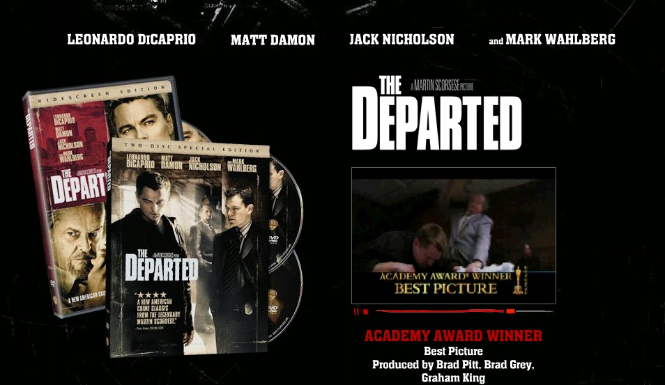
- This is the main page of the website for the film 'The Departed'
- This image does not give the audience a lot of information about the film, but they are made aware of what the DVD cover looks like which will make it easier to find if people want to buy it.
- There is also a teaser trailer located underneath the bold title.
- The actors names are placed and the top of the page, the audience can then see that there are many famous actors in this film, which in a was can promote it.
- The colours features are mainly black, white and red which are the main colours found relating to the horror genre.
- The background looks black however there is a picture in the background but only parts of it are visible this means the audience have to look more intently to see what the image is and it does not immediately distract the attention from the images in the foreground.

- This is the image from the bottom of the main page. On this part of the web page the audience is able to click on the writing in red and find out more information about aspects of the film.
- Just underneath the film trailer the audience are visually told that this film is directed by Martin Scorsese, who won the award for best director for this specific film.
- The typography also changes as someone moves the mouse on top of it, it changes colour from red to white and becomes unfocused the focused again, this adds an edge to the typography and makes it more interesting to look at.

- When one of the links has been clicked in for example cast, the image in the background has come up and the colours have reversed compared to the main page. The main colour is now white.
- The actors picture is also layered over the background, and the picture of the actor is a screen shot from the film.
- More links are available from this page and the information is in quite a small font but legible, the picture is the main feature of the page.
Saturday, 9 October 2010
Monarchy - The phoenix alive
This music video is by the same band as before but the beginning of the video (first min) is very inspirational. There are many close-up shots which don't reveal too much about what the person in the video looks like. These types of shots would be very useful for our trailer as we can use them when showing shots of the villain, so as not to give too much away about who the villain may be.
Monarchy - Love get out of my way
This is a music video that we felt in various parts was inspirational for lighting techniques. Specifically the beginning the just the one figure under the spotlight and then the other four figures appear. This could look quite effective in our film trailer. The end shot is effective too as the light fades and the figures fade into the background.
Thursday, 7 October 2010

This cat picture is made up of letters. The piece is too intricate in detail to use whole words, which would create confusion.
 This food one shows how we could create letters out of objects and items. The limitations would be that detail is lost as the main idea is to create a visual impact.


Saturday, 2 October 2010
Stills from other trailers


- These are some stills from other film trailers that are inspiration for the types of shots we can use in our trailer.
Subscribe to:
Posts (Atom)