
Thursday, 16 December 2010
Tuesday, 14 December 2010

Sunday, 5 December 2010
Final Anchorage
We're expanding on our anchorage and to make it look and feel more authentic we have also been looking through some dictionaries to gain the correct definition. We have decided to include aspects such as the original Latin origin of the word "amputate" which is amputatus.
the font of the anchorage was becoming increasingly difficult to get exactly right. Eventually we opted for the font used in the dictionary to for the original spelling of origin of the word. This gave the feel and atmosphere we were looking for.
the font of the anchorage was becoming increasingly difficult to get exactly right. Eventually we opted for the font used in the dictionary to for the original spelling of origin of the word. This gave the feel and atmosphere we were looking for.
Thursday, 25 November 2010
Poster development


In these images we were experimenting with font and colour to see which on would look most effective for our film title. We made the word 'Brutal' less transparent, but still visible. For our final poster we have decided not to use colour in our title, as we want the focus to be on the injury on the girls neck. This is why we made the background of the image grey scale, as the red becomes prominent.


Tuesday, 23 November 2010
Poster

This is an image we are most likely to use for our poster.
The title will go at the top of the image.
More poster ideas!


These are a few more ideas of images we can use for out poster. These are very basic images and the people in the images above are not the people we would use in the actual poster but we were just looking at composition and lighting
Tuesday, 16 November 2010
Poster Idea 1 - Disembodied limb
 |


I also like how the pink of the shirt contrasts well to the paleness of the skin and the surroundings. More emphasis is placed on the eerie and deathly aspect of the body.
Thursday, 4 November 2010
Green Screen on imovie!
We found this video teaching us how to use green screen on imovie. We played around briefly with trying to use green screen but we have decided it is not a good feature to use in our film trailer.
We have a website!!
We are on the way to creating a website! I am currently making the basis of what will eventually our website to promote our film as part of our promotional package.
We are intending on creating multiple pages as opposed to just a home page. One, in particular, contains hyperlinks to other sites, such as facebook, twitter etc. This helps to promote our film y using multiple forms of media.
I am using a website called http://www.sitebuilder.yola.com/ to create it.
Here's the link!
http://www.3g324.yolasite.com/
More imovie research
This video taught us once again how to use the picture in picture effect. This Video also taught us how to stabilize our footage so if we had and jerky footage we could make it move a little less. This is a feature we have used in our trailer.
imovie research
This video taught us how to use picture in picture effect on imovie and we later tried this out with some of our footage but have decided against using it for the meantime.
Memento Website
Memento Website
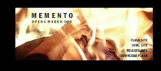 *Website homepage with links down the right hand side that you can click on that take you to various other areas of the site.
*No sound on this page.

 This is the second image you see when you click on the flash site. Some words fade in and you can later click on these words and they give you a link to something else in the site that relate to specific ares of the film, these words are incorporated into sentences and produce a newspaper article. This article can also be found by clicking on the HTML site.


*No sound on this page.

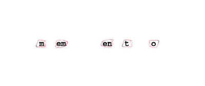
Flash site - these are the first images you see when you connect to the flash site, the title of the film comes up firstly and the letters are then used to create a phrase that relates to the film.


Once you have clicked on one of the words, these are the types of images that come up and they are either images from the film or things that relate to the narrative.


Release info is another option you can click on from the home page and it then gives you link to cast, crew, storyline, venues and then gives you a link option which takes you to more links where you can find the trailer and extra information about the film. The release info sight also shows stills from the film. The release info sight also uses different transitions and effects as it develops into the page on the left. When you click on the release info tab, as the page is loading, the audience are given quotes to read about the film. Momento is a user friendly sight, everything is fairly simple and straightforward to view.
 The release info sight also shows stills from the film. The release info sight also uses different transitions and effects as it develops into the page on the left. When you click on the release info tab, as the page is loading, the audience are given quotes to read about the film. Momento is a user friendly sight, everything is fairly simple and straightforward to view.
 Beginning of anchorage


Okay, so we're now beginning to add some anchorage to out teaser trailer. We have decided to contain details about amputation and body parts. In order to help us do this we raided the school's history cupboard for a "Medicine and Health through time" text book. We have already included "With a rusty saw a limb can be removed in 30 seconds flat" and we will add more like this throughout the trailer.
Tuesday, 2 November 2010
Poster Idea
Using a police tape, we could layer typography over an image to suggest the police/crime element of our film.
We could either photograph police tape like the example below or we could use a still from our film trailer.

We could either photograph police tape like the example below or we could use a still from our film trailer.

This is the original image -  We erased the original text using "paint" to cover it up. If we were to use this idea we would have to use a more professional program to make the quality better.
 We erased the original text using "paint" to cover it up. If we were to use this idea we would have to use a more professional program to make the quality better.
 Monday, 18 October 2010
Institutions
We are now beginning to think about what institution would be most likely to promote our film. One of the most influential films for research for us is Silence of the Lambs. The institution they have used is Orion Pictures. However, our group has never heard of this and we are unfamiliar with that company. Because of this we have decided to not use this company.
Following more research we found that Se7en was promoted by New Line Cinema; which is a company that we are much more familiar with. Because of this we have decided to use this company's logo because we already know much more about it.
Following more research we found that Se7en was promoted by New Line Cinema; which is a company that we are much more familiar with. Because of this we have decided to use this company's logo because we already know much more about it.
Sunday, 10 October 2010
Typography


A brief look into different types of typography mainly to make images rather than a title.
The Departed Website
The Departed Website


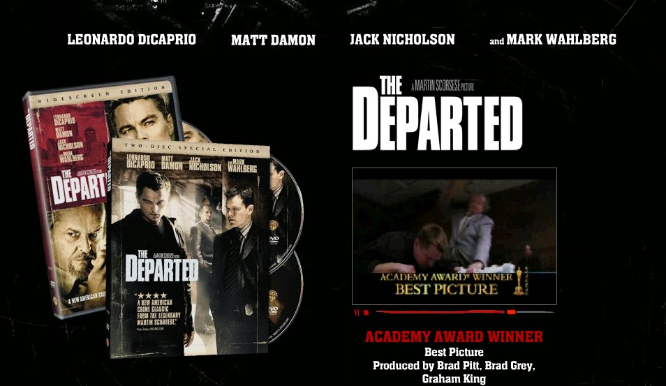
- This is the main page of the website for the film 'The Departed'
- This image does not give the audience a lot of information about the film, but they are made aware of what the DVD cover looks like which will make it easier to find if people want to buy it.
- There is also a teaser trailer located underneath the bold title.
- The actors names are placed and the top of the page, the audience can then see that there are many famous actors in this film, which in a was can promote it.
- The colours features are mainly black, white and red which are the main colours found relating to the horror genre.
- The background looks black however there is a picture in the background but only parts of it are visible this means the audience have to look more intently to see what the image is and it does not immediately distract the attention from the images in the foreground.

- This is the image from the bottom of the main page. On this part of the web page the audience is able to click on the writing in red and find out more information about aspects of the film.
- Just underneath the film trailer the audience are visually told that this film is directed by Martin Scorsese, who won the award for best director for this specific film.
- The typography also changes as someone moves the mouse on top of it, it changes colour from red to white and becomes unfocused the focused again, this adds an edge to the typography and makes it more interesting to look at.

- When one of the links has been clicked in for example cast, the image in the background has come up and the colours have reversed compared to the main page. The main colour is now white.
- The actors picture is also layered over the background, and the picture of the actor is a screen shot from the film.
- More links are available from this page and the information is in quite a small font but legible, the picture is the main feature of the page.
Saturday, 9 October 2010
Monarchy - The phoenix alive
This music video is by the same band as before but the beginning of the video (first min) is very inspirational. There are many close-up shots which don't reveal too much about what the person in the video looks like. These types of shots would be very useful for our trailer as we can use them when showing shots of the villain, so as not to give too much away about who the villain may be.
Monarchy - Love get out of my way
This is a music video that we felt in various parts was inspirational for lighting techniques. Specifically the beginning the just the one figure under the spotlight and then the other four figures appear. This could look quite effective in our film trailer. The end shot is effective too as the light fades and the figures fade into the background.
Thursday, 7 October 2010

This cat picture is made up of letters. The piece is too intricate in detail to use whole words, which would create confusion.
 This food one shows how we could create letters out of objects and items. The limitations would be that detail is lost as the main idea is to create a visual impact.


Saturday, 2 October 2010
Stills from other trailers


- These are some stills from other film trailers that are inspiration for the types of shots we can use in our trailer.
Subscribe to:
Comments (Atom)