In these images we were experimenting with font and colour to see which on would look most effective for our film title. We made the word 'Brutal' less transparent, but still visible. For our final poster we have decided not to use colour in our title, as we want the focus to be on the injury on the girls neck. This is why we made the background of the image grey scale, as the red becomes prominent.
Thursday, 25 November 2010
Poster development
Tuesday, 23 November 2010
Poster
This is an image we are most likely to use for our poster.
The title will go at the top of the image.
More poster ideas!
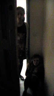
These are a few more ideas of images we can use for out poster. These are very basic images and the people in the images above are not the people we would use in the actual poster but we were just looking at composition and lighting
Subscribe to:
Comments (Atom)


